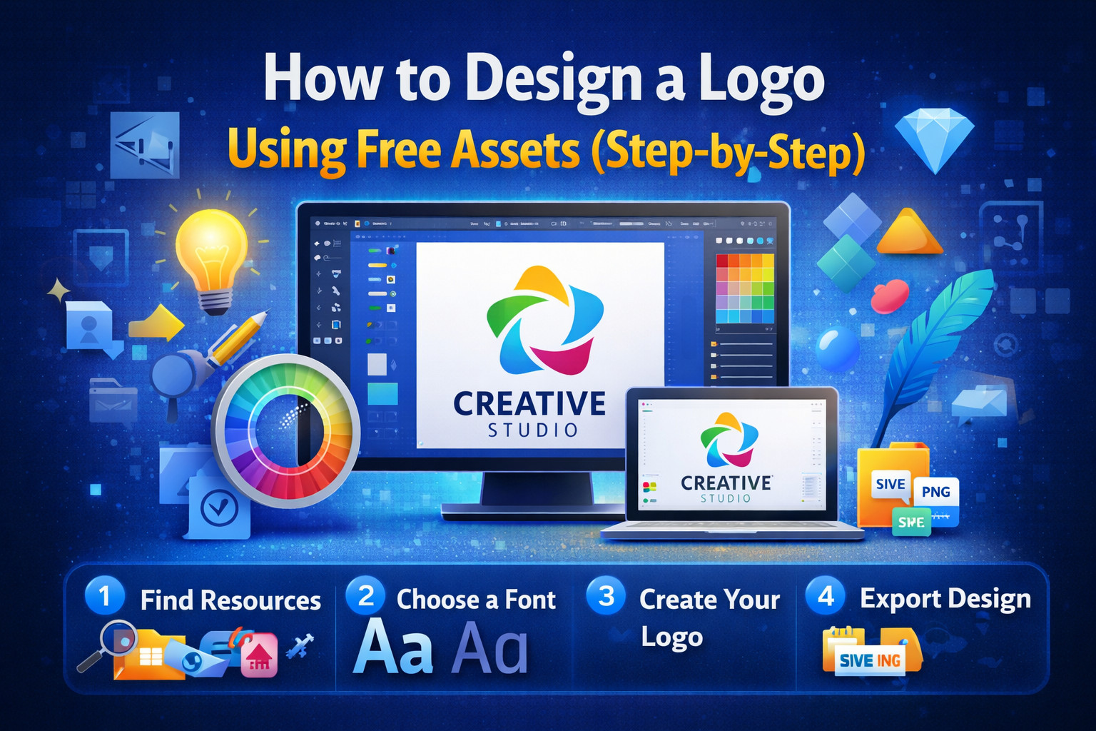
How to Design a Logo Using Free Assets (Step-by-Step)
How to Design a Logo Using Free Assets (Step-by-Step)
Designing a professional logo doesn’t have to be expensive or complicated. With the availability of high-quality free assets and modern design tools, anyone can create a stunning logo—even without advanced design skills. Whether you’re a freelancer, startup owner, or content creator, this step-by-step guide will help you design a logo using free resources in a simple, efficient, and mobile-friendly way.
Why Use Free Assets for Logo Design?
Free assets are a game-changer for beginners and professionals alike. They allow you to save time, reduce costs, and still achieve high-quality results.
Benefits of using free assets:
- No upfront cost
- Access to thousands of design elements
- Faster design process
- Great for testing ideas and concepts
- Ideal for startups and personal brands
⚠️ Always check licensing to ensure the assets are allowed for commercial use.
Learn about licenses here:
https://creativecommons.org/licenses/
Step 1: Define Your Brand Identity
Before you start designing, you need a clear understanding of your brand.
Ask yourself:
- What does your brand stand for?
- Who is your target audience?
- What emotions should your logo convey?
👉 Branding basics guide:
https://www.shopify.com/blog/branding
Step 2: Choose the Right Design Tool
You don’t need expensive software to create a logo. There are several free tools available that work perfectly on both desktop and mobile.
Recommended tools:
- Figma → https://www.figma.com
- Canva → https://www.canva.com
- Photopea → https://www.photopea.com
These tools allow you to import free assets and customize them easily.
Step 3: Find High-Quality Free Assets
Now it’s time to gather design elements for your logo. These can include icons, shapes, and fonts.
Best sources for free assets:
- Google Fonts → https://fonts.google.com
- Freepik → https://www.freepik.com
- Flaticon → https://www.flaticon.com
- Font Squirrel → https://www.fontsquirrel.com
Look for:
- Simple and scalable icons
- Clean and readable fonts
- Minimal and versatile shapes
Step 4: Choose the Right Font
Typography plays a huge role in logo design. The font you choose should match your brand identity.
Font styles and meanings:
- Sans-serif → modern, clean
- Serif → classic, trustworthy
- Script → elegant, creative
- Display → bold, attention-grabbing
👉 Explore font inspiration:
https://fontpair.co
Step 5: Create Your Logo Concept
Start combining your elements:
- Add your icon
- Insert your brand name
- Apply your chosen font
- Adjust size and spacing
Keep these principles in mind:
- Simplicity is key
- Make it memorable
- Ensure scalability (looks good small & large)
- Maintain balance and alignment
Step 6: Choose Colors Wisely
Colors have a psychological impact and influence how people perceive your brand.
Common color meanings:
- Blue → trust and professionalism
- Red → energy and passion
- Green → growth and nature
- Black → luxury and sophistication
👉 Color inspiration tool:
https://coolors.co
Step 7: Optimize for Mobile & Web
Your logo should look great everywhere—especially on mobile devices.
Mobile-friendly tips:
- Use simple shapes
- Avoid tiny details
- Ensure readability on small screens
- Test your logo at different sizes
👉 Responsive design basics:
https://web.dev/responsive-web-design-basics/
Step 8: Export in Multiple Formats
Once your logo is ready, export it in different formats for various uses:
- PNG (transparent background)
- JPG (for general use)
- SVG (scalable for web)
Learn about file formats:
https://www.adobe.com/creativecloud/file-types/image/vector/svg-file.html
Step 9: Test Your Logo
Before finalizing, test your logo in real-world scenarios:
- Social media profile picture
- Website header
- Business card
- Mobile screen preview
Mockup resources:
https://mockups-design.com
Step 10: Keep Improving
Logo design is an evolving process. Don’t be afraid to tweak and improve your design over time.
You can:
- Get feedback from others
- Try different font combinations
- Experiment with layouts
Pro Tips for Better Logo Design
- Avoid copying other logos
- Keep it unique and original
- Use grids for alignment
- Maintain proper spacing
- Focus on clarity over complexity
Common Mistakes to Avoid
- Using too many fonts
- Overcomplicating the design
- Ignoring scalability
- Choosing random colors
- Not checking licensing
Final Thoughts
Designing a logo using free assets is not only possible—it’s incredibly effective when done right. With the right tools, resources, and approach, you can create a professional logo that represents your brand perfectly.
This step-by-step guide gives you everything you need to get started. Take your time, experiment with ideas, and focus on creating something simple, memorable, and meaningful.
Start Designing Today
Now that you know the process, it’s time to create your own logo. Explore free assets, pick your tools, and bring your brand vision to life.
Your perfect logo is just a few steps away 🚀